What Font is Best for posters? They are powerful tools for grabbing attention, spreading information, and creating excitement. From street festivals to movie premieres, a poster’s design can make or break its impact. While color, images, and layout matter, choosing the best font is one of the most important decisions. The right font does more than look good—it tells your audience what to feel, helps them read quickly, and makes your message unforgettable.
But which font is truly best for posters? The answer is not as simple as picking something “cool” or “stylish. ” You need to think about visibility, tone, and even where your poster will hang. Let’s explore how to make smart font choices for posters, with real examples, practical tips, and a deep dive into what actually works.
Why Font Choice Matters For Posters
A poster is usually seen from a distance, sometimes for only a few seconds. Readability is key—people must be able to understand your message instantly. Fonts also set a mood: playful, serious, elegant, or bold. The wrong font can confuse people or even make your poster invisible in a crowded space.
Consider a music festival poster versus a health awareness campaign. The festival might use big, energetic fonts to match the excitement, while the health poster needs a calm, clear typeface to build trust. Font choice is not just decoration—it’s a communication tool.
Key Factors When Choosing A Poster Font
Several factors help you decide which font is right for your poster.
1. Readability And Legibility
Legibility is how easily letters can be identified, while readability is how easily the full message can be understood. Sans-serif fonts like Helvetica or Futura are famous for their clarity, especially from a distance. Avoid overly decorative or thin fonts for main messages.
2. Size And Scale
Your main message should be the largest text on the poster. Subheadings and details can be smaller, but they still need to be readable. Choose a font that looks good in large sizes without losing shape. Some fonts, like Impact, are designed to stay bold and readable even when blown up.
3. Contrast And Color
A great font can fail if it blends into the background. Use strong color contrast—like black text on a white background or white on dark blue. Some fonts have thicker strokes that make them stand out better against busy backgrounds.
4. Branding And Tone
Fonts carry personality. Serif fonts like Times New Roman can feel classic or formal. Script fonts may feel elegant or playful, but can be hard to read in large blocks. Match your font to the mood you want to create and your brand’s style.
5. Practical Details
Think about where your poster will appear. If it’s outside, it faces sunlight, weather, and distance. Indoors, you might have more control over lighting. Test your font choices in real-world conditions before finalizing.

Popular Font Types For Posters
Not every font works for every poster. Here are the main categories and when to use them:
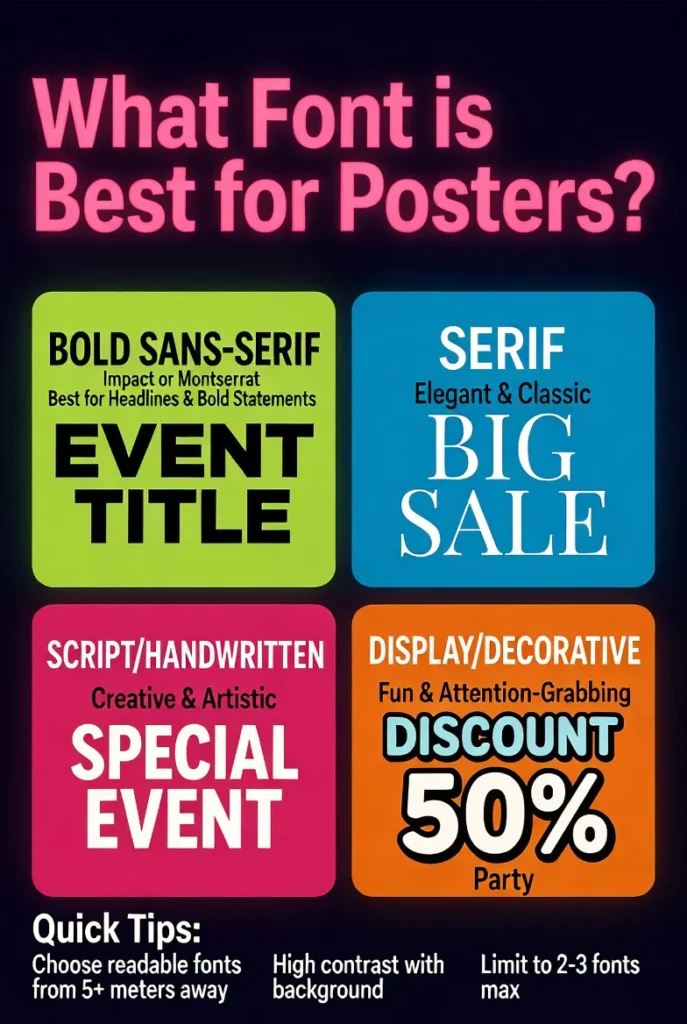
Sans-serif Fonts
These fonts have clean lines without little “feet” (serifs) on the ends. They’re modern and easy to read. Examples include:
- Helvetica
- Arial
- Futura
- Montserrat
Best for: Modern events, tech, sports, clean and simple messages.
Serif Fonts
These fonts have small lines at the ends of letters. They look more classic or traditional. Examples:
- Times New Roman
- Bodoni
- Georgia
- Playfair Display
Best for: Formal events, academic posters, anything needing a touch of elegance.
Slab Serif Fonts
A special kind of serif with thick, blocky serifs. They offer both impact and tradition.
- Rockwell
- Roboto Slab
- Arvo
Best for: Vintage designs, strong headlines.
Script And Decorative Fonts
Script fonts look like handwriting or calligraphy. Decorative fonts are unique and often themed.
- Pacifico
- Lobster
- Brush Script
- Bangers
Best for: Titles, creative projects, but use sparingly for main text.
Top 10 Fonts For Posters (with Practical Insights)
Here’s a look at ten of the most effective poster fonts, including why they work and where they shine.
| Font Name | Type | Best Use | Why It Works |
|---|---|---|---|
| Helvetica | Sans-serif | Any modern poster | Super clear, neutral, professional |
| Impact | Sans-serif | Bold headlines | Thick, eye-catching, readable at a distance |
| Futura | Sans-serif | Minimalist designs | Geometric style, timeless look |
| Montserrat | Sans-serif | Trendy posters | Modern feel, works well large |
| Bebas Neue | Sans-serif | Event posters | All-caps design, strong presence |
| Rockwell | Slab Serif | Vintage themes | Chunky serifs, retro feel |
| Playfair Display | Serif | Elegant posters | High contrast, classic style |
| Lobster | Script | Creative posters | Fun, friendly script, but best in small doses |
| Avenir | Sans-serif | Modern branding | Balanced, clean, versatile |
| Georgia | Serif | Formal or literary posters | Elegant, easy to read even at small sizes |
Serif Vs. Sans-serif: Which Is Better For Posters?
This classic debate isn’t about right or wrong. Each has strengths:
| Feature | Serif Fonts | Sans-Serif Fonts |
|---|---|---|
| Readability (from far) | Good, but can blur | Excellent, sharp edges |
| Formality | High, traditional | Casual or modern |
| Use Case | Academia, luxury | Events, tech, startups |
Non-obvious insight: Mixing both types can create a dynamic poster—use a serif for the headline and sans-serif for details, or vice versa. Just don’t mix too many fonts at once.
How Many Fonts Should You Use On A Poster?
Less is more. Most experts recommend sticking to one or two fonts. A third font can work for special accents, but too many different styles look messy and confuse the eye.
- One font: Clean, simple, modern look. Use different weights (bold, regular) for contrast.
- Two fonts: Adds interest. Choose styles that contrast but complement each other (e.g., a bold sans-serif with a light serif).
- Three or more: Only if you really know what you’re doing, and only for very creative designs.
Practical tip: Avoid pairing fonts that look too similar—contrast helps guide the reader’s attention.
Font Size Guide For Posters
Choosing the right font size is crucial for visibility. There’s no universal answer, but here are some common guidelines:
| Poster Size | Main Headline | Subheading | Details |
|---|---|---|---|
| 11″ x 17″ (small) | 48–72 pt | 30–48 pt | 20–30 pt |
| 18″ x 24″ (medium) | 72–120 pt | 48–72 pt | 30–48 pt |
| 24″ x 36″ (large) | 120–180 pt | 72–120 pt | 48–72 pt |
Non-obvious insight: Always print a test version and view it from the expected distance. On-screen sizes can be misleading, especially with big posters.
Common Mistakes When Choosing Poster Fonts
Avoid these typical errors for better results:
- Using thin or light fonts for main headlines—they disappear from a distance.
- Too much decoration—ornate scripts or novelty fonts are tempting but often unreadable.
- Poor color contrast—yellow on white, for example, can be invisible in sunlight.
- Ignoring hierarchy—if everything is bold and big, nothing stands out.
- Not testing in real-world conditions—lighting and environment can change everything.

How To Pair Fonts Successfully
Font pairing is a skill that takes practice. Here’s how to do it right:
- Pick a strong main font for your headline.
- Choose a simpler font for body text or details.
- Look for contrast in weight, width, or style.
- Use font families that offer many weights (like Roboto or Montserrat) for easy pairing.
A classic combination: Bebas Neue for the headline, Montserrat for information.
Examples Of Poster Fonts In Action
Let’s look at real-world examples:
- Music festival poster: Bebas Neue (headline), Montserrat (details) — creates excitement and clarity.
- Film screening: Playfair Display (title), Avenir (info) — blends classic and modern.
- Charity event: Rockwell (headline), Arial (details) — friendly but serious.
If you’re curious to see famous poster designs and their fonts, the Wikipedia Poster page offers a visual history.
Tips For Choosing And Using Poster Fonts
- Think about your audience. Young people may prefer bold, modern fonts, while older viewers might need extra clarity.
- Don’t forget accessibility. Clear fonts help everyone, especially people with vision problems.
- Use font weights wisely. Bold for headlines, regular or light for details.
- Test in different lighting. Outdoor posters need extra-strong contrast.
- Keep consistency. Stick to your chosen fonts throughout the poster.
Frequently Asked Questions
What Is The Most Readable Font For Posters?
Helvetica is often called the most readable font for posters, especially in large sizes. Its clean lines and balanced spacing make it easy to read from a distance. Other good choices include Arial and Montserrat, which are also widely available and look clear on both print and digital posters.
Can I Use Decorative Or Script Fonts For A Poster?
Yes, but with care. Decorative and script fonts are best used for short titles or special accents, not for main messages or body text. Overusing them can make a poster hard to read. Always test script fonts at the final size to be sure they stay clear and attractive.
How Do I Choose Font Colors For My Poster?
Pick colors with high contrast against the background. For example, black or navy text on a white or light background, or white text on a dark background. Avoid using colors that blend together, like yellow on white or red on green.
Good contrast ensures your poster can be read in any lighting.
How Many Fonts Are Too Many On A Poster?
Two fonts are usually enough—one for the headline, one for details. A third font can be used for very special emphasis, but more than that usually looks messy and confuses the viewer. Consistency and clarity are more important than variety.
What’s The Best Free Font For Posters?
Montserrat and Bebas Neue are two of the best free fonts for posters. Both are available on Google Fonts and work well for headlines and large text. They’re modern, clean, and easy to read, making them safe choices for most poster projects.
Choosing the right font for your poster is about more than style—it’s about getting your message across quickly and clearly. Focus on readability, strong contrast, and matching the font’s personality to your theme. Limit your choices to two fonts, test your design in real-world conditions, and remember: the best font is the one your audience can read and remember. By following these tips, your next poster will stand out for all the right reasons.