The Ultimate Guide to the Best Color for Outdoor Furniture in 2026: Choosing the Perfect Hue for Style, Durability, and Comfort
In the world of outdoor living, color isn’t just an aesthetic choice—it’s a strategic decision that impacts everything from comfort and durability to mood and resale value. Whether you’re furnishing a sprawling backyard patio, a cozy balcony, or a luxurious poolside lounge, the right color for your outdoor furniture can transform your space into a harmonious extension of your home and nature. But with so many options—from timeless neutrals to bold statement hues—how do you decide what’s truly “best”?
As we head into 2026, outdoor furniture trends are leaning heavily toward earthy, lived-in palettes that blend seamlessly with the environment. Think terracotta, sage green, weathered sand, mossy olives, and soft taupe tones that feel grounded yet elevated. These colors aren’t just fashionable; they’re practical, designed to age gracefully under the sun while resisting fade and wear thanks to modern UV-resistant materials and fabrics like Sunbrella.
This comprehensive guide will walk you through everything you need to know. We’ll explore why color matters, the key factors to consider, detailed breakdowns of the top-performing colors with pros, cons, and real product examples (including stunning visuals), styling tips, maintenance secrets, current trends, and common pitfalls to avoid. By the end, you’ll be equipped to select furniture that looks stunning year after year while enhancing your outdoor lifestyle.
Why Color Choice Matters More Than You Think
Color selection for outdoor furniture goes far beyond personal preference. It influences three critical areas: practicality, aesthetics, and psychology.
Practicality First: Outdoor furniture endures relentless sun, rain, wind, dust, and temperature swings. Lighter colors reflect sunlight and UV rays, staying cooler to the touch and minimizing heat absorption—ideal for hot climates where dark surfaces can reach scorching temperatures. Darker or vibrant hues, conversely, absorb more heat and may fade faster if not treated with solution-dyed acrylics or powder-coated finishes. Dirt visibility is another factor: light neutrals like beige show stains more readily, while mid-tones like gray or terracotta hide everyday wear.
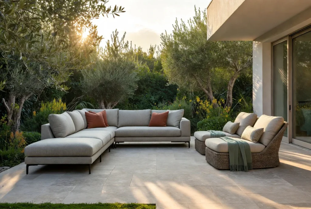
Aesthetics and Harmony: Your furniture should complement—not clash with—your home’s exterior, landscaping, and hardscaping. A sage green set against lush foliage creates a seamless, natural flow, while a coastal blue lounge evokes serenity by the pool. Mismatched colors can make even high-end pieces look out of place.
Color Psychology: Outdoor spaces are for relaxation and entertaining. Cool tones (blues, greens) promote calm and focus, perfect for reading nooks or meditation areas. Warm earth tones (terracotta, sand) foster warmth and appetite, suiting dining sets. Neutrals provide a versatile backdrop that adapts to seasonal decor changes via pillows and rugs.
In 2026, the shift away from stark modern blacks and whites toward organic, nature-inspired palettes reflects a broader desire for sustainability and connection to the outdoors. These colors “fade gracefully” rather than degrade, thanks to advancements in materials.
Choosing wisely saves money long-term by reducing replacements and maintenance headaches.
Key Factors to Consider When Selecting Colors
No single color is universally “best”—it depends on your unique setup. Here are the non-negotiable factors:
- Climate and Sun Exposure: In sunny, hot regions (think Southwest or Florida), prioritize light-reflecting shades like beige, sand, or light gray to keep seats comfortable. Shadier or cooler northern climates allow deeper tones like moss green or charcoal without overheating. High UV areas demand fade-resistant fabrics; always check ratings (e.g., 500+ hours of UV protection).
- Surrounding Landscape and Home Exterior: Match or contrast thoughtfully. Earthy tones blend with gardens and stone patios. Coastal homes shine with blues and whites. Urban rooftops benefit from sleek grays. Stand in your space at different times of day—morning light versus golden hour—to test how colors “read.”
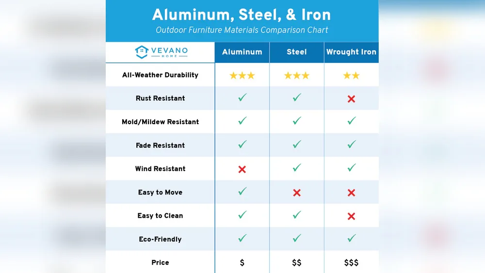
- Material Compatibility: Color interacts differently with materials. Powder-coated aluminum holds vibrant hues well. Teak or acacia woods develop a silvery patina, so natural stains pair best with earth tones. Wicker or resin often comes in neutrals for a woven, organic look. Cushions (Sunbrella or similar) offer the most color flexibility.
- Maintenance and Lifestyle: Busy families or pet owners prefer mid-tones that camouflage spills. If you entertain frequently, opt for wipe-clean surfaces in versatile grays. White requires more upkeep but looks crisp and luxurious.
- Style and Usage: Modern minimalist spaces love monochromatic grays or blacks. Bohemian patios embrace layered terracotta and greens. Dining sets might favor bolder accents, while loungers stay neutral for year-round appeal.
- Budget and Longevity: Premium brands invest in color-fast technologies. Cheaper options may fade in 1-2 seasons. Factor in warranties—many top lines guarantee 3-5 years against fading.
- Lighting Conditions: Full sun intensifies colors; shade softens them. Evening use? Lighter tones reflect artificial light better for safety and ambiance.
Weigh these against your priorities, and you’ll narrow options dramatically.
The Top Colors for Outdoor Furniture in 2026: Detailed Breakdowns
Based on 2025-2026 trends and performance data, here are the standout choices. Each includes pros/cons, ideal scenarios, and product examples.
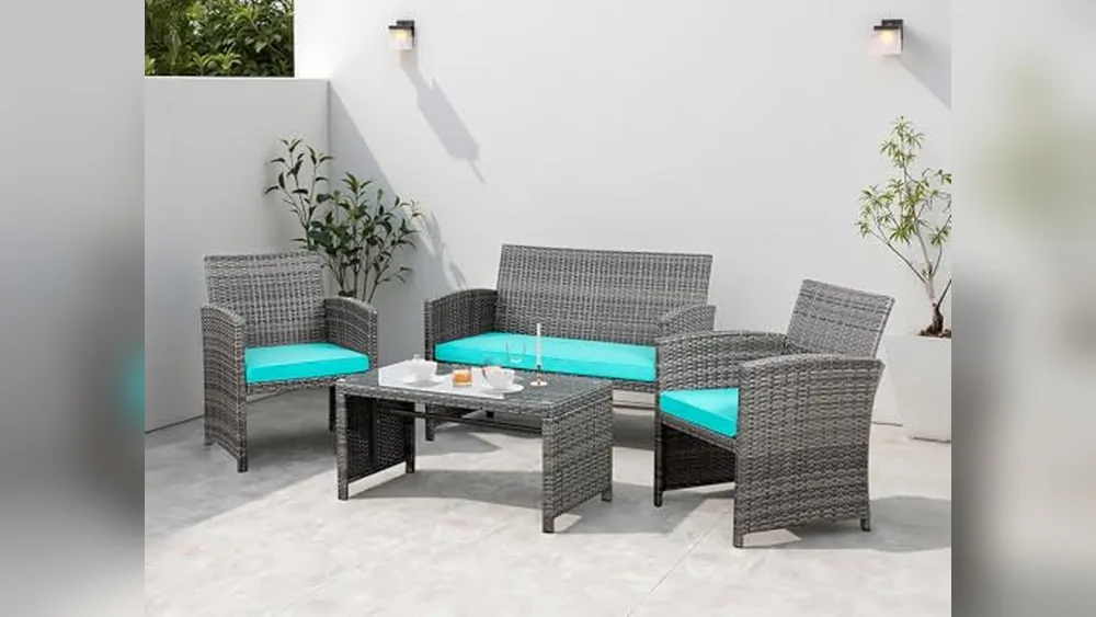
1. Slate Gray and Neutral Grays – The Versatile Champion Gray reigns supreme for its timeless appeal and practicality. Slate gray, in particular, offers depth without the heat of black. It hides dirt exceptionally well, reflects moderate light, and pairs with any accent color.
Pros: Fade-resistant in quality finishes; cooler than black; modern yet neutral; works with wood, metal, or wicker. Cons: Can feel cold in overcast climates without warm accents.
Ideal for: Contemporary patios, urban balconies, or family spaces.
Example: This PURPLE LEAF 7-piece gray sectional with ottoman exemplifies the trend—durable all-weather construction, plush cushions, and a sophisticated look that elevates any backyard.
2. Beige, Sand, and Weathered Neutrals – Timeless and Cooling Weathered sand and beige tones dominate 2026 for their natural, sun-bleached vibe. They reflect heat brilliantly and evoke beachy or desert serenity.
Pros: Stay cool; blend with most landscapes; timeless; less maintenance than pure white. Cons: Show dirt if not treated; may appear washed out in deep shade.
Ideal for: Hot climates, poolside, or coastal homes.

Example: This Sandra wicker sofa set in beige delivers resort-style comfort with UV-resistant cushions—perfect for sunny patios.
3. Sage Green and Moss Green – Nature’s Harmony Botanical greens bridge furniture and foliage, creating cohesive, calming spaces. Sage offers softness; moss adds richness.
Pros: Serene mood; excellent UV stability; hides light wear; elevates any garden. Cons: Can blend too much if your yard is very green.
Ideal for: Lush backyards or eco-friendly designs.

Example: Simple yet chic sage green stackable chairs like these from modern collections add playful elegance without overwhelming the space.
4. Terracotta and Earthy Rust Tones – Warm and Inviting. Terracotta brings warmth and grounding energy, trending heavily for 2026’s “lived-in” aesthetic.
Pros: Warmth without heat absorption (in quality pieces); hides stains; pairs beautifully with wood. Cons: Bold—best as accents if you prefer subtlety.
Ideal for: Mediterranean or boho patios, dining areas.
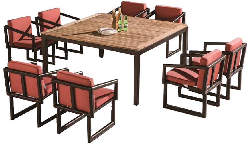
Example: This Amber dining set with warm-toned cushions captures the earthy 2026 vibe, crafted for durability.
5. Coastal Blues (Navy to Soft Sky) – Serene and Refreshing Blues evoke water and sky, remaining popular for relaxed retreats.
Pros: Mood-boosting calm; versatile with neutrals; good fade resistance in deep shades. Cons: Navy can absorb heat; lighter blues show dirt.
Ideal for: Pool decks or beach-inspired spaces.

Example: This rattan coastal blue set brings ocean vibes indoors or out.
6. Black and Dark Neutrals – Modern Edge with Caveats Sleek black offers drama but requires caution in full sun.
Pros: Hides dirt; sophisticated; pairs with metallics. Cons: Gets very hot; shows scratches.
Use sparingly or with covers.

Example: This black metal dining set suits shaded modern decks.
7. White and Light Neutrals – Crisp Luxury Pure white looks fresh but demands upkeep. Opt for off-white for practicality.
Pros: Brightens spaces; timeless. Cons: High maintenance.
Great for low-dust areas.
How to Style Your Chosen Colors
Layer textures—wicker with metal accents, cushions in complementary tones. Add rugs, umbrellas, and planters for depth. For gray bases, introduce terracotta pillows. Greens shine with floral patterns.
Maintenance Tips to Preserve Vibrant Colors
Clean biannually with mild soap. Use covers off-season. Reapply sealants on wood. Pressure wash gently. Sunbrella fabrics need minimal care.
Common Mistakes to Avoid
Ignoring climate, choosing trendy brights that fade, or neglecting material-color synergy.
Shopping Guide and Conclusion
Look for brands like Polywood, Trex, or Sunbrella-certified lines. Budget $500–$5,000+ per set. In 2026, earthy neutrals win for longevity and beauty.
The “best” color ultimately aligns with your life, space, and priorities. Earthy tones like sage, terracotta, and sand lead trends while delivering performance. Invest thoughtfully, and your outdoor oasis will reward you for years. Earthy Neutrals vs. Bold Hues: What’s the Best Color for Outdoor Furniture Right Now?